
















 Team
Team FAQ
FAQ Prices
 Vacancies
 Contact
 Marketing
 SEO
SEO SEA
SEA Strategy
 Sales
Sales Optimization
 AWR
AWR Ahrefs
 Channable
 ContentKing
 Leadinfo
 Optmyzr
 Qooqie
 Hubspot
 Semrush
Written by Niek van Son MSc on April 26, 2024

Last updated June 3, 2024
Introduction
Think about choosing a new smartphone. There used to be only a few models available, which made choosing relatively easy. Today, the market is flooded with hundreds of models, each with its own specifications and features. You can spend hours comparing these details, which often results in frustration and postponement of the purchase.
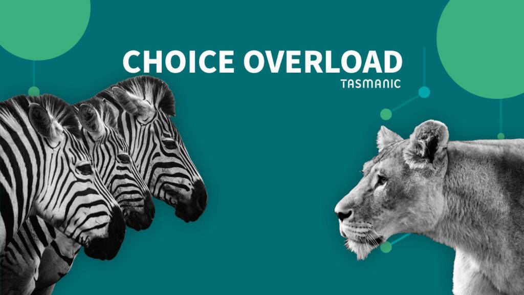
Choice stress affects us all from time to time. This phenomenon, also known as choice overload, can be paralyzing and consume a lot of energy. In extreme cases, it even leads to complete indecision, with people preferring not to make a choice at all. As an entrepreneur, your challenge is to prevent this from happening to your customers.
What is choice overload?
Choice overload is the crippling excess of choices (Toffler, 1970). The more options people are given, the more difficult making a choice is, the less satisfied they are with their choice and the more likely they are to regret their choice (Iyengar & Lepper, 2000).
Even though many people like having more choice options, it actually makes making a choice more difficult. This can lead to procrastination. But not only that, having too many options also leads to a decreased sense of satisfaction, being less convinced about your choice and a greater chance of regretting your final choice (Chernev, Böckenholt & Goodman, 2015).
This applies to "smaller" choices, such as which flavor of tea, as well as larger choices, such as choosing an advanced education. Because of the almost infinite possibilities, this can lead to brooding behavior, which in turn can lead to feelings of anxiety or depression (Schwartz, 2005). The more difficult the choice, such as limited choice time or multiple differences between options, the greater the choice stress. Sometimes people choose not to make a choice at all. This saves (mental) energy.
How does choice overload occur?
In today's age, we are overwhelmed by the amount of choices. We also feel blessed to have so many choices, because it was different in the past. Back then it was already more or less determined what kind of work you were going to do and you really didn't have to be picky about food. More choice is therefore seen as more freedom and autonomy, as something positive, while it can also make your life less enjoyable (Schwartz, 2004). It creates higher expectations, and therefore a greater chance of being disappointed. The more options we have, the more likely we think we are to choose the right one. As a result, our expectations are high and things may well disappoint.
Several factors influence choice overload. Researchers Chernev, Böckenholt and Goodman (2015) distinguish the complexity of the choice, the difficulty of the choice, feelings of uncertainty and the purpose for which the decision serves. For example, we may feel uncertain in a choice if we have little knowledge about the product, but there are many options. To further complicate matters, this can also create the opposite choice overload. If you have a lot of knowledge about something, then few choice options can actually lead to choice stress (Chernev, Böckenholt & Goodman, 2015). And with some products we do experience choice stress, while there are also products that do not cause it, such as a wide selection of souvenirs. There, on the contrary, we want lots of choice.
In addition, there is a difference in types of people. We distinguish so-called maximizers and satisficers. Satisficers are satisfied if the product does what they expect of it. Maximizers want to consider all possible options and only then make a choice. Maximizers are more likely to be choice overloaded, less optimistic and more often depressed (Schwartz, 2004). Social media and FOMO today create an even greater need to make the most of a choice (Hiebert, 2014).
Examples in practice
- The weather is nice and you're at the ice cream parlor. They have some new limited editions again. Do you go for the flavor that is always delicious or do you venture out and try a new flavor? You don't want to regret it, because you're not going to buy another ice cream and next time they might not have the limited edition anymore...but if it disappoints you'll regret not just going for your familiar choice!
- You need a new laptop, but there are so many makes and models and they all have their own pros and cons that you're at a loss. You decide to leave it for now, to look into it again at a later time.
Using choice overload to your advantage
Besides the fact that stress is not nice, as a business owner you want potential customers to make a choice. Namely, the choice for you. Some things you can do:
- Make choices between your products or services extremely simple. Make very clear distinctions. Remove options that are not significantly different from other options.
- When a product does require many variations, it should be abundantly clear to the consumer what the differences are between them.
- Use recommendation software that offers visitors certain options based on preference or previous choices, for example. This also increases the likelihood of greater satisfaction with the final choice.
- Don't put pressure on consumers to choose. This may ultimately result in not making a choice.
- After placing an order, compliment consumers on their good taste and choice. That way there is less chance of feelings of regret.
Resources
Chernev, A., Böckenholt, U., & Goodman, J. (2015). "Choice overload: A conceptual review and meta-analysis." Journal of Consumer Psychology, 25(2), 333-358.
Hiebert, P. (2014). "The paradox of choice, 10 years later." Pacific Standard.
Iyengar, S. S., & Lepper, M. R. (2000). "When choice is demotivating: Can one desire too much of a good thing?" Journal of Personality and Social Psychology, 79(6), 300-322.
Schwartz, B. (2004). "The paradox of choice: Why more is less." Harper Perennial.
Toffler, A. (1970). "Future Shock." Random House.
THE AUTHOR
Niek van Son MSc
Marketing Management (MSc, University of Tilburg). 10+ years of experience as an online marketing consultant (SEO - SEA). Occasionally writes articles for Frankwatching, Marketingfacts and B2bmarketeers.nl.
Is your company missing opportunities?
Our pay is based on your results.